Hierarchy on Grid Shafa Hawladar
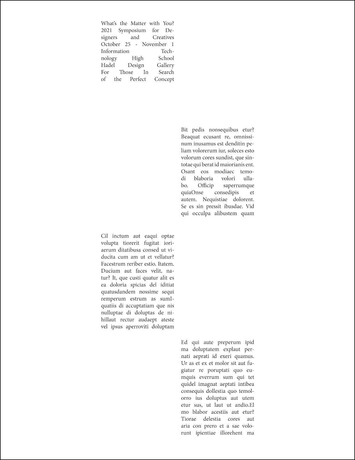
This one is Hierarchy on grid 1. We weren't allowed to use bold, change colors, or size, so I decided to mess around with the paragraph settings and spaced out some text. I wanted to make the What's wrong with you? text stand out, so I ended up spacing it out more than the others. I think it went ok.
This one is Hierarchy on grid 2. This one was one of the more easier ones to make. For this one, I decided to remove some more text and make some sort of pattern with the ones remaining. For the What's wrong with you? text, I decided to change the paragraph settings and spaced out a bit on the other boxes. I think it turned out to be alright.
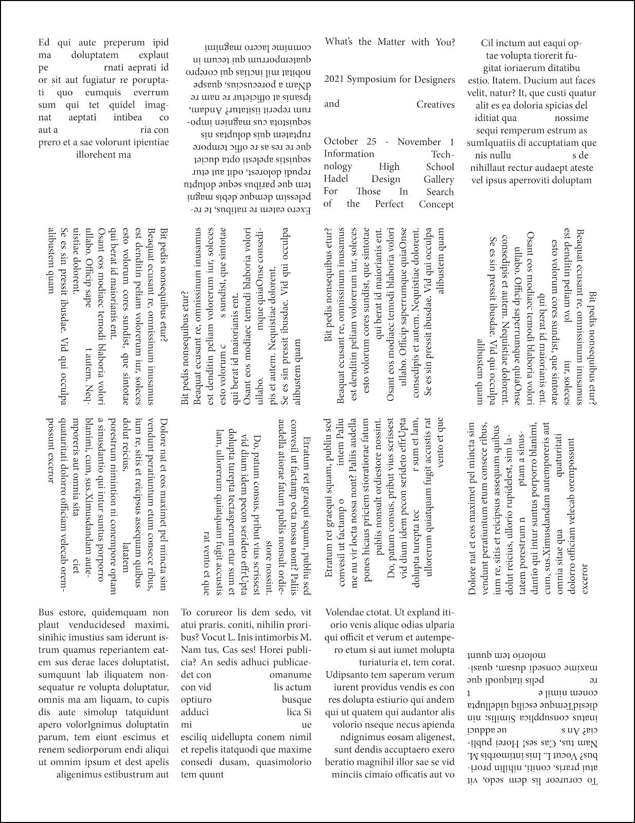
This one is Hierarchy on grid 3. This one was one of the more fun ones to do. For this one, I decided to rotate some of the text and do more spacing. I also changed the title text back to how it previously was and made a space box on 1 of them. I think it turned out ok.
This one is Hierarchy on grid 4. This one was one of the more harder ones to make, as I didn't really know what to do for this one. For this one, I mostly switched the places of some text boxes and changed the paragraph settings on a few of them. I also changed the paragraph settings on the What's wrong with you text and spaced it out a bit more. I think it turned out alright.
This one is Hierarchy on grid 5. This one was one of the more easier ones to make, as I had deleted more text boxes and made some more space blanks. I decided to do a similar pattern to the 2nd one but with the white space instead and made some weird space waves. I think it turned out to be ok.


Comments
Post a Comment