Hierarchy Technicals Shafa Hawladar
This one has No Hierarchy, so I just copy pasted the text onto adobe.
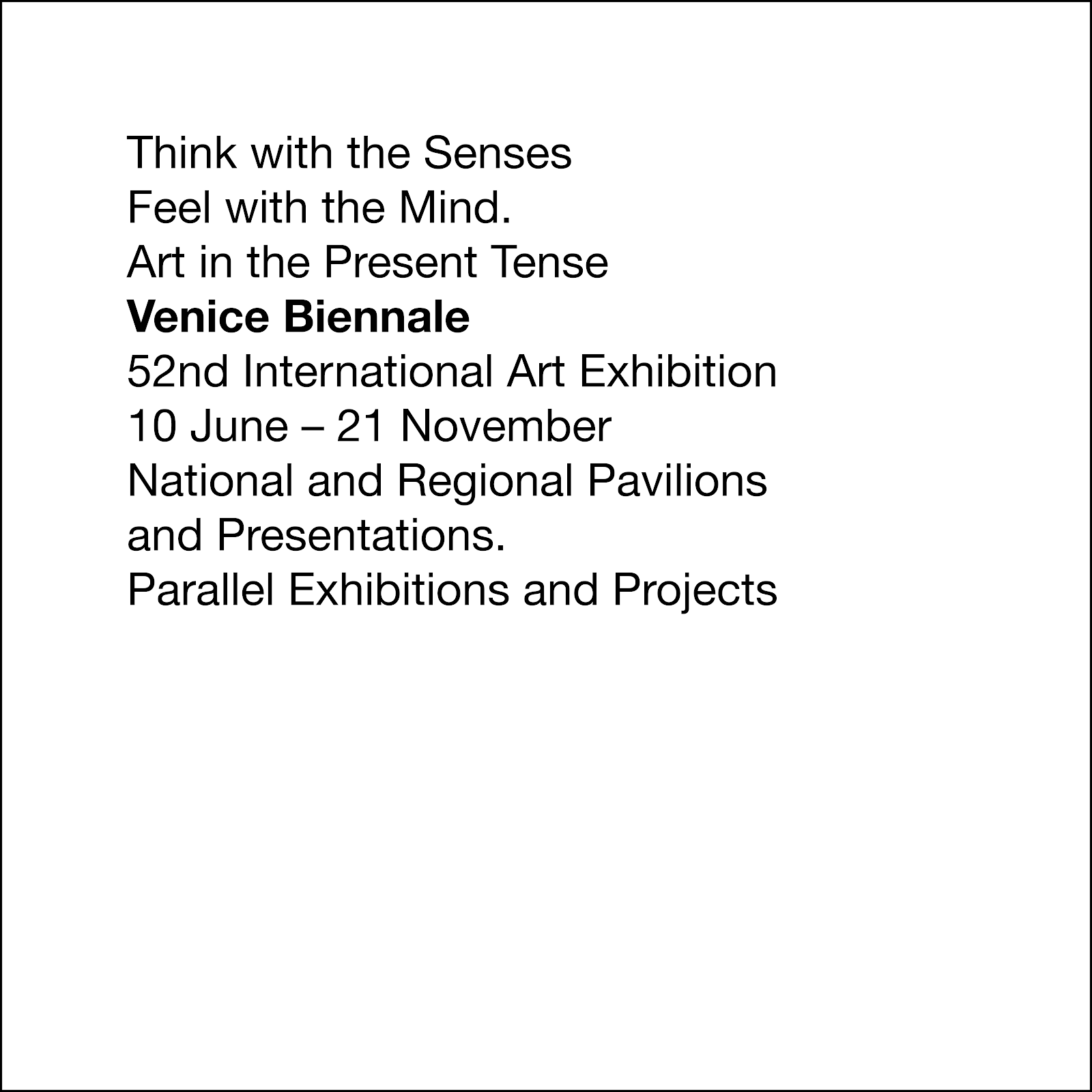
This one was Contrasting weight. For this one, all I really did was copy paste the text and bolded the Venice biennale. The first few were actually pretty easy to do and I managed to do most in 1 day as there wasn't too much difficulties in doing them.
This one was Contrasting color. For this one, I bolded the Venice biennale text and changed the color to red. It wasn't very difficult and I think it turned out ok.
This one is Alignment. This was probably one of the harder ones to do, as we weren't allowed to use the space bar. I messed around with the text spacing and all until I managed to get it to the left, but I think it turned out alright in the end.
This one is Spatial Intervals. For this one, I pressed return a couple of times and then use the text space tools to move it closer. The stuff starts to stand out more here.
This one is Uppercase and spatial intervals. For this one, I copy pasted the previous spaced out text and capitalized the Venice Biennale text.
This one is Weight, color, space, alignment. For this one, I copy pasted the alignment and changed the font color to be red. After that, I bolded the betters and pressed return.
This one is Italic, scale color, weight, alignment. This one was probably one of the more fun one to make, as you could finally put it all together. For this one, I changed the font to italic, and pressed return a few times. After that I bolded the dates and enlarged the Venice Biennale text. Then I changed the color to red and used the text space tools to get it to the left.


Comments
Post a Comment